Friday, 7 March 2008
Saturday, 1 March 2008
Post Production
Texts in Maya
Rendering
This kind of rendering is called NON PHOTO REALISTIC RENDERING or NPR. I found this blog of Jon Farrel very interesting:
http://qualitytrash.blogspot.com/2007/09/non-photorealistic-rendering-tests.html
He wrote: "Recently I have been curious about nonphotorealistic rendering. So over the past little while I have been doing tests and checking out the options in achieving nice looking renderings. I was already familiar with ways of creating nonphotorealistic renderings with Renderman, from reading the book "Advanced Renderman Creating CGI for Motion Pictures". I was curious though about what other options existed to create these types of renders. Below are some of my findings.
Interestingly enough, Maya actually has several very good examples of nonphotoreaslistic render styles. My two favorites are below, rendered out in their default settings unless noted.
The other program I found that has very promising results is an opensource line renderer called Freestyle. It allows programmable python shading for the lines you create from you 3d object. Very cool stuff. If you want to check it out there is a link to the left in my links section. The bottom two renders below were done with a style module called JapaneseBigBrush which can be found on the freestyle site.
Overall I am very impressed at the results of my little study. I hope to harness some of these cool shaders and effects for use in a short animation."

A watercolor setup with defualt Maya parameters. Note the very cool bleeding effects present in the render. I composited the render over a paper texture to add to the effect. Other than that there is no post-render work.

this is a frame from an animated sequence I tested. I modified the defualt Maya visor setup to produce these images. The lines you see are a painteffects brush applied to the model which has a transparent shader attached. The Paper texture I grabbed off the internet and used as a camera plane so as to get rid of the need for any post compositing.

Two teapots rendered with Freestyle using the Japanese Big Brush style module.
I am very impressed with the beautiful renders this program puts out. This image is actually two separate renders of the same teapot. I composited the images and took down the opacity of the smaller teapot.
Simple Rigging and a Little of Animation
1st shot:
Camera slowly tracks along characters (their introduction) until it notices a little girl with grandpa
2nd shot:
Close up - so we can see some little animation, then camera
3rd shot:
Camera moves on, to the last character in the room.
4th shot:
Camera tracks in from behind, until it stops on a wall with picture.
Little Poly's Animation
I tried setting different sorts of mechanisms into characters, but the easiest way to aminate limbs is with splitting them apart where we want joints (like on puppets) then INSERT THE PIVOT POINTS so these can rotate around them and PARENT parts properly.
Before splitting limbs , we need to do linear smooth and then duplicate limb few times, to get parts we need. ends need to be remodeled and pivot points adjusted so that we don't lose nice shape of them.
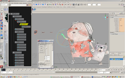
I discovered hat if i want to turn the character 180 degrees from the left to the right, then I just need to RESCALE IT on y axis. I might set the driven key not to lose the original size.
This turned out to be quite sharp move and on certain point our eye catches the gap between two freames (straight en-face) , although there is none:
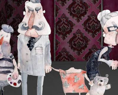
To avoid this problem I cut out all the frames that were in between the extremes (kept just scale 1 and -1) in postproduction.
Joint animation would be very complicated and would would demand proper weight painting, so I didn't decide for it.
The Lighting and The Room
I am very interested in texturing and lighting.To achieve this misterious darkish gallery space with old sort of William Morris-Victorian lily patterned wall papers and decor, I enlighten it with darkish red lights and did light linking.
The viewers are lightened and lighltlinked separately. Characters are enlightened form the front with sharp bright light, which helps distinct their features better.
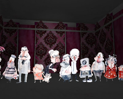
...and in shadow when showd from the back.
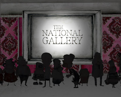
The Room
Room consists of 2D flat elements, everyone is textured separately and then layered in the 3D space.
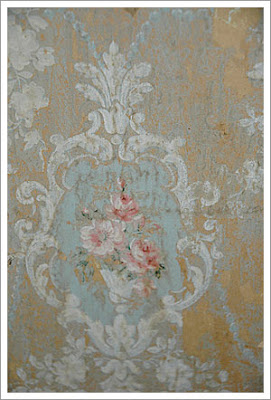
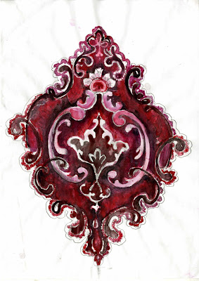
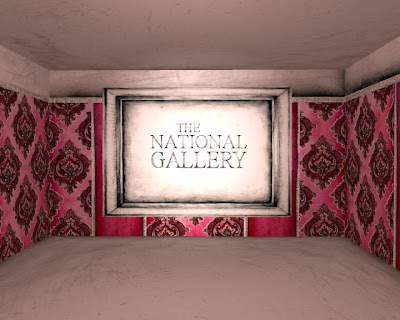
Modeling and texturing finished!
I became quite familiar with using graphic tablet to create some textures in Photoshop. I found a brush that makes things look like done with water colours. Now I am looking forward for my new toy- Wacom Intuos 3 A5 tablet.
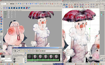
All models gathered in one space:


